What do People in Need and Franz Kafka Have in Common: The Story of Our Logo
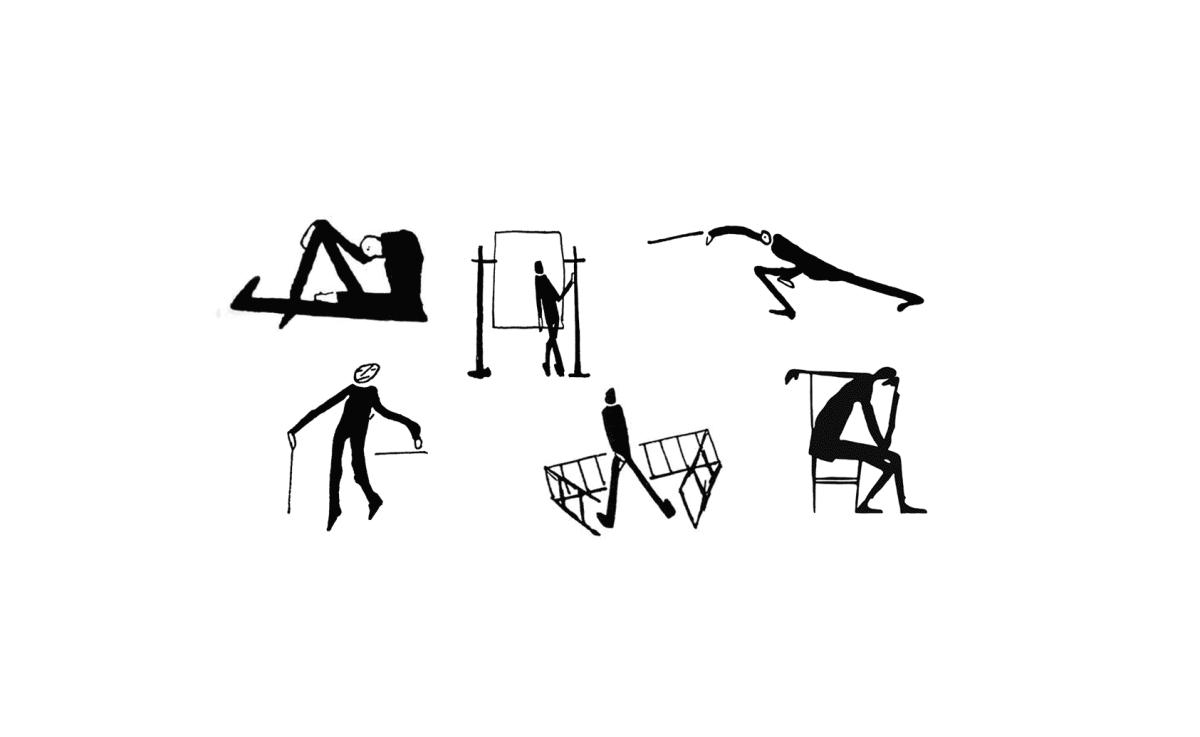
Published: May 14, 2019 Reading time: 2 minutes Share: Share an articleThe logo of People in Need depicts a man with his arms behind his back, restricted by a fence from three sides.

One of the founders of People in Need, Jan Urban, told the Czech daily Deník Referendum: “The logo of People in Need was established by a unanimous choice from several drafts made by the artist Adam Hoffmeister. I brought them to the editorial staff of Lidové noviny on Národní street as Adam’s gift. The selection took no more than 2 minutes, because the theme of a “person in need” resonated with all of us present there.”
The name of the organisation is a variation on a successful humanitarian operation of the time. Called “Nachbar in Not” ("Neighbour in Need" in English), it was organised by the Austrian public television ORF. The neighbour was Yugoslavia, where a civil war was raging during the 1990s.
How was the sketch itself created?
In November 1907, Franz Kafka started working for the Italian insurance company Assicurazioni Generali. His correspondence from that time indicates that he was unsatisfied with his work schedule, because it prevented him from focusing on writing. At that time, he said he felt more like an author of sketches than a writer. In a letter to his girlfriend Felice Bauer, he wrote: “I would have certainly become a great author of sketches, but I learned to draw in the school system under the guidance of a mediocre painter, so I lost my talent."
About fifty of Kafka’s sketches have survived to this day. Some of them are exhibited in the Kafka Museum in Prague.


