
People in Need celebrates 30 years with a new logo. Participants in the design competition worked pro bono
Published: May 31, 2022 Reading time: 6 minutes Share: Share an articlePeople in Need wants to be more positive in its visual communication. We are changing our current logo to a brand that is more positive and universally understandable. The new logo works with the simplest possible imagery of the human figure. The logo has been designed to be comprehensible in all possible languages and cultural contexts. Graciously the contestants in this competition waived their right to royalties for sketch fees, contest winnings, and licensing. Studio Marvil created the winning logo.
Since our foundation in 1992, People in Need has been branded with a distinctive logo consisting of an illustration of a figure inside a diamond with white text within a black border. The logo was inspired by an illustration by Adam Hoffmeister, based on a drawing by Franz Kafka. "Almost 30 years ago, we chose the logo of People in Need, we knew the name, and we knew that the logo should express the situation in which we were working at that time, which was mainly war and conflicts. Franz Kafka's drawing and the black and white colouring of the logo fit perfectly, but since then, we have gone through a certain maturation," says Šimon Pánek, the director and co-founder of PIN.
However, as the organisation grew, functional barriers emerged, such as complications with the international variant, language mutations, or low readability in smaller formats due to the text being typed directly into the logo. The content of our work has also changed, noted Pánek; thus, the message associated with the logo needs to change. "We are a large, essentially global organisation, we are no longer a bunch of friends of similar age and cultural focus, but an organisation of two thousand people, most of whom are significantly younger, maybe a generation younger than us founders, and who live outside Europe in Asia in Africa have a different cultural background, not perception," comments Pánek on the decision. Today, in addition to humanitarian and social aid, People in Need is also involved in the field of education or organises the One World Festival.
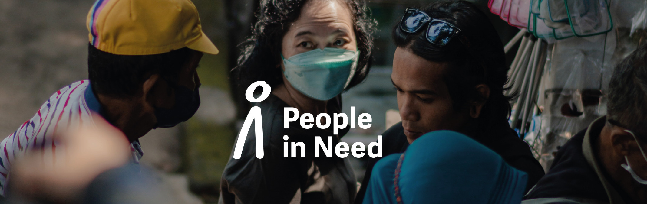
The new logo is based on a simple symbol of a person and our name. It is recognisable and legible in the field and from a distance. The change also includes a deep blue colour to emphasise the described shift in meaning and a new colour palette for the different areas of the organisation's work. "There is a change in the narrative, which no longer says that the world is "screwed up", but that it is possible to change it. We want to be more positive, more understandable and be able to use the logo in different contexts, towards our donors, partners, and communities with work with," Pánek adds.
The Competition and the winners
The new logo came from a design competition. We were helped from the beginning by Czechdesign, an NGO that specialises in setting fair conditions in professional competitions and facilitating collaboration with designers. All participants waived their sketch fees and designed their entries for the competition pro bono. The winner also provided a free license of the typeface of the visual. This free license was granted to People in Need by its creator, Veronika Burian from TypeTogether, a type studio in Molėtai. The specialist repository BrandCloud also provided its services pro bono.
"The change of the People in Need logo is clearly a positive step. The winning Studio Marvil simplified the original symbol of a straddling figure of a man into a more understandable form. Also, thanks to the change of colour from black to blue, the whole identity looks friendly and expresses hope, which is crucial for the communication of this important organisation," comments Aleš Najbrt, the expert judge of the competition.
Three participants from among domestic graphic designers, Lumír Kajnar, Studio Marvil and a trio consisting of Tereza Hejmová, Štěpán Moravec and Martin Odehnal, were invited to participate in the one-round competition based on careful research. Their designs will be presented separately in Czechdesign Magazine.
The introduction of the new logo will be a gradual, long-term process, and the new and old logos will exist side by side for some time. In the first period after introducing the new brand, the logo will change on the most visible aspects of PIN, such as the main website and social media profiles. This will be followed by branches in the Czech Republic and missions abroad. Then, it will gradually change according to the priorities of visibility and the difficulty of the replacement. We intend to finish existing printed materials to make the change as economical and environmentally friendly as possible.
Studio Marvil
The winning logo was created the Studio Marvil team consisting of Tereza Saitzová, Vojtěch Vavřín, Jiří Karásk and Olga Benešová, under the direction of Pavel Zelenka.
Marvil mainly focuses on corporate identities, editorial design and book editing. The results of their work can be seen, for example, in the newly opened permanent exhibitions of the National Museum in Prague. They have also created visual identities for Czech Radio and ČEZ. Recent projects include the identity for the Janštejn Glass group and the publications Historical and Contemporary Architecture and TON +-160. In 2018, the studio was awarded the prestigious Red Dot Design Award for its implementation for TON. It was also part of the Beazley Design of the Year exhibition in London with the visual identity of the Railway Administration.
Czechdesign
Czechdesign is a professional umbrella organisation that takes care of the development of design in the Czech Republic. It promotes the application of design in practice and fair conditions in professional competitions. It operates the most read web portal on Czech design www.czechdesign.cz, supports and promotes Czech designers, advises companies and institutions on how to cooperate with designers, and is a leading organiser of design and architectural competitions.
People in Need
People in Need was founded in 1992 by a circle of war correspondents and journalists dissatisfied with just bringing back information about ongoing wars from their travels abroad. So, they began to bring aid to conflict areas. PIN gradually established itself as a professional humanitarian organisation with the aim of helping in crisis areas and promoting respect for human rights around the world. During its thirty years of existence, it has also expanded to work in the field of education, helping people living in social exclusion, and organising the One World International Documentary Film Festival.